Maddie & Adam
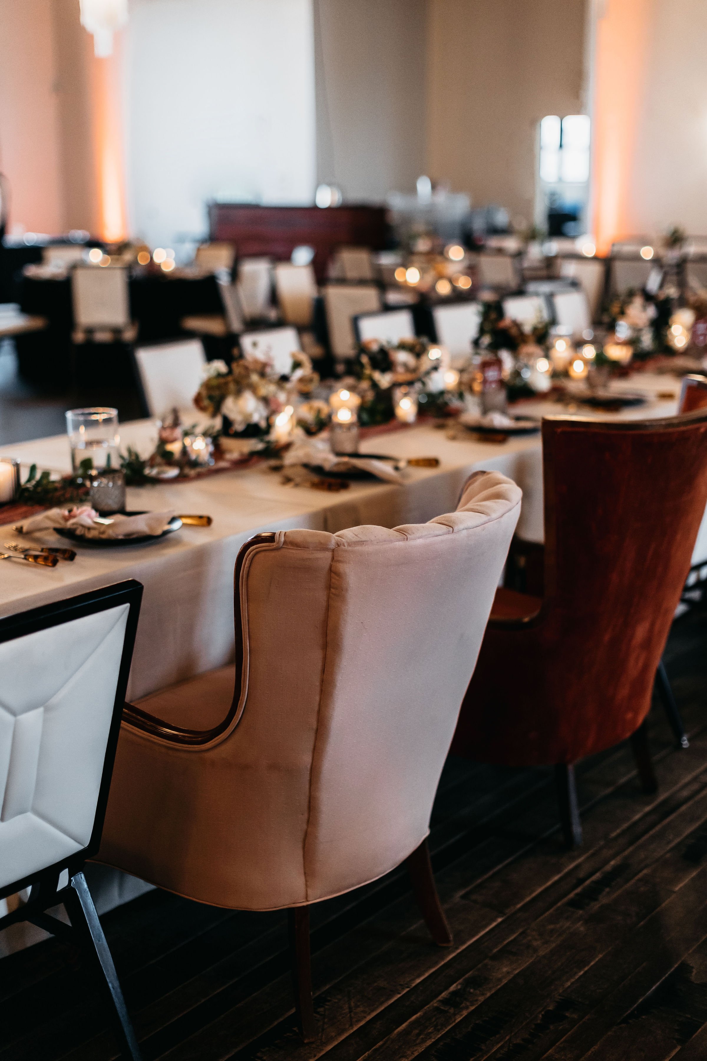
July 16, 2022 | The Caramel Room
Stationery & Branding Details:
Direction and Inspiration: Clean and modern with lots of texture!
Main Invitation: Black letterpress on a highly-texture paper stock.
Palette: Neutrals with pops of warm brown.
Branding Details: Texture and color were huge factors in M&A’s wedding stationery and branding. We stuck with materials like textured papers, vellum and velvet for a rich but clean overall feel. Their typography was clean and modern which was the perfect compliment to the venue.
OTD’s Favorite Detail: The coloring book wall!! In lieu of a traditional guest book, Maddie and Adam opted for a coloring wall as a nod to her profession as a teacher! Such a fun, interactive detail and personal touch!
Contributing Vendors
Planning & Event Design: Altar’d Events
Photography: Jess and Jenn Photography
Branding and Stationery: On Three Designs
Venue: The Caramel Room


